New Signature Ideas: 21 Fresh Handwritten Styles
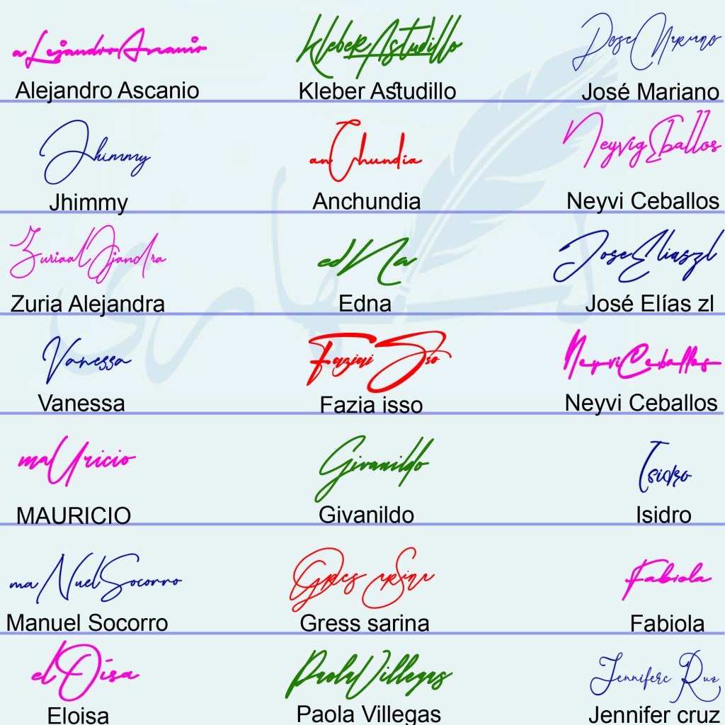
New signature ideas do not need more decoration; they need a fresh relationship between the initial, the name body and the final stroke. The 21 examples in this collage explore modern-looking full names, compact monograms, tall angular capitals, readable single names and bold abstract marks.
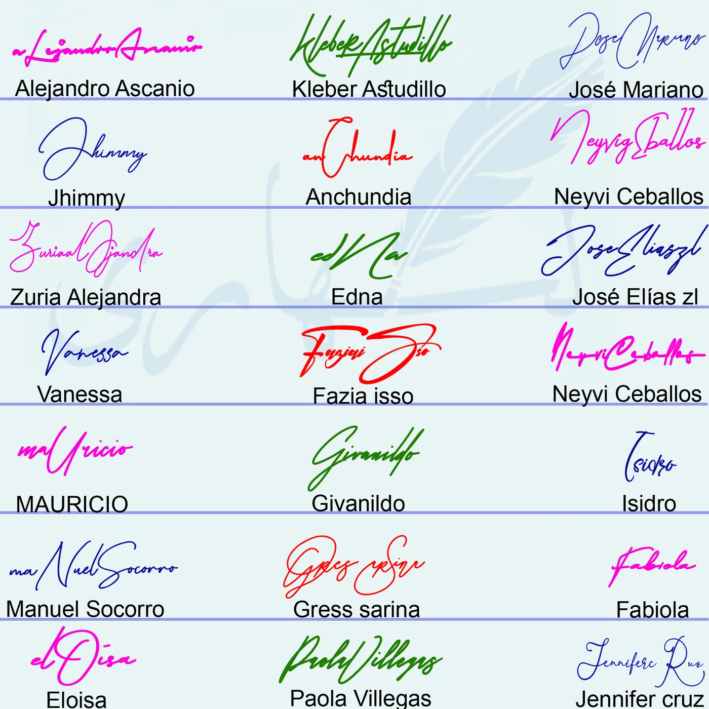
The different colors make the designs easier to compare, but color is not the structure of a signature. Test any idea again in the pen color you normally use. What should survive is the silhouette: the opening letter, direction of the middle, spacing between names and the finish.
In this gallery
- Explore the fresh design directions
- Compare two versions of one name
- Choose a modern structure
- Develop an original variation
Fresh signature directions shown in the gallery
Long horizontal full-name flow
Alejandro Ascanio, José Mariano and Paola Villegas stretch the signature across the line while keeping the vertical height controlled. This direction feels modern because the letters move as one composition. It works best when the name has enough natural connections and the capitals do not interrupt the flow.
Tall angular capitals with a compact body
Kleber Astudillo uses a strong rising K-like structure and a narrow, energetic middle. The contrast between height and compression creates a bold silhouette. For everyday use, keep the crossing points simple so the design does not depend on exact drawing.
Small monogram-style marks
Edna and Isidro show how a name can be reduced to an initial-led mark. Edna is especially compact, using a central capital movement with only a hint of the rest of the name. This approach suits people who want a short signature, but the mark needs a consistent starting direction and ending.
Readable single names with one memorable curve
Jhimmy, Vanessa, Givanildo and Fabiola preserve enough letters to keep the name visible. Each design has a clear feature—a large opening loop, a slanted capital, a long connection or a compact ending—without forcing decoration onto every letter.
Two-capital signatures for two-part names
Zuria Alejandra, Manuel Socorro, Paola Villegas and Jennifer Cruz use the second capital to organize the surname or second name. A fresh two-capital design usually works when one capital is dominant and the other acts as a transition rather than a competing centerpiece.
Bold abstract marks
Fazia Isso and Gress Sarina use broad curves and compressed internal letters. These examples show that a signature can be expressive without staying fully readable. The practical test is whether the same large curves and final direction can be reproduced when signing quickly.
What the two Neyvi Ceballos examples teach
Neyvi Ceballos appears twice in the collage, which makes the image especially useful. The upper version is taller and more open, with a large rising initial and greater separation between the two name movements. The lower version is flatter, denser and more horizontal. Neither structure is automatically better: the first prioritizes visual presence, while the second favors compactness.
When testing a new signature, create alternatives that change one dimension at a time. Make one taller, one shorter and one more readable. This produces a meaningful comparison instead of three designs that differ only in tiny decoration.
Choose a new structure that fits your name
| Goal | Gallery direction | What to test |
|---|---|---|
| Modern full-name look | Alejandro Ascanio or Paola Villegas | Keep both names connected but reduce the detail between capitals |
| Short personal mark | Edna or Isidro | Use one distinctive initial movement and a stable ending |
| Readable and fresh | Vanessa, Jhimmy or Fabiola | Retain several letters and add only one strong curve |
| Bold initial-led style | Kleber Astudillo | Test a tall opening stroke with a smaller, faster body |
| Compact two-word signature | Lower Neyvi Ceballos construction | Flatten the height and shorten the surname movement |
A fresh design can still belong to a familiar category such as cursive, minimalist, initials or full-name. Review the different signature styles before choosing which structural family you want to modernize. For more expressive options, see the creative signature ideas collection.
Develop an original version from one idea
- Choose the structural feature. Select the tall initial, compact monogram, two-capital hierarchy or long horizontal flow—not the entire finished signature.
- Apply it to your own letters. Let your natural connections decide where the pen changes direction.
- Make three controlled variations. Change height, readability or ending in separate versions.
- Test in one normal pen color. Remove the distraction of color and compare the actual shapes.
- Write at signing speed. Eliminate any detail that disappears or causes hesitation.
- Create a clean digital copy only after the movement is stable. A generator should preserve your design, not replace the design process.
Frequently asked questions
What makes a signature idea look new?
A fresh signature usually changes proportion, initial hierarchy, connection or spacing rather than adding random decoration. The design should still be practical enough to repeat.
Should I use color in my signature?
Use the color normally accepted for your context. The colored gallery is for comparing designs; the signature structure should remain effective in ordinary blue or black ink.
How many versions should I make?
Three purposeful versions are usually enough: one readable, one compact and one more expressive. Change one major feature in each version.
Can I use a monogram as a signature idea?
A monogram can be a useful visual direction, especially for initials or a short mark. Whether a specific form is accepted for a particular process depends on that organization’s requirements.
How do I avoid copying another signature?
Borrow a construction—such as a tall capital plus compact surname—and rebuild it with your own letters and natural hand movement. Do not trace the finished autograph.
Single Signature Examples from This Collection
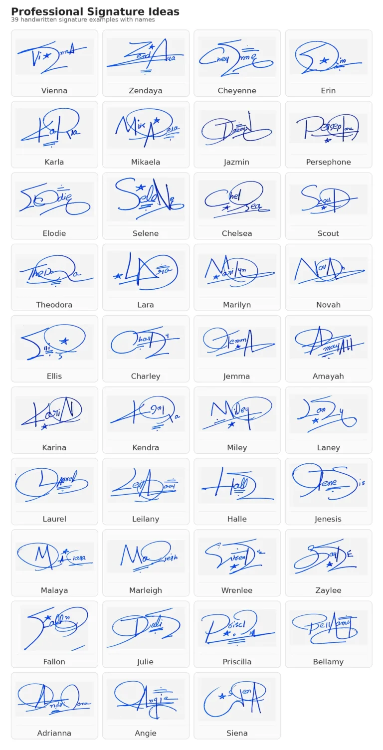
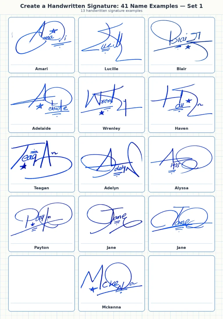
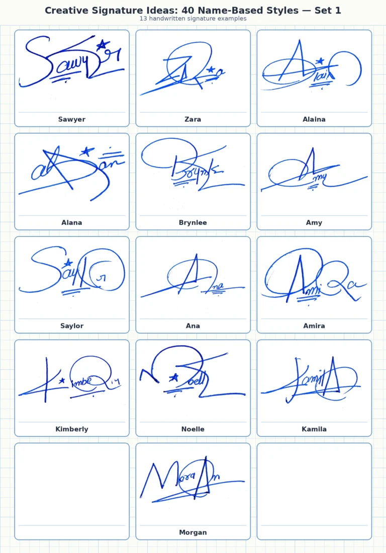
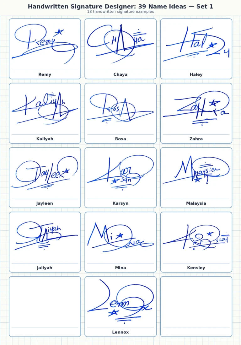
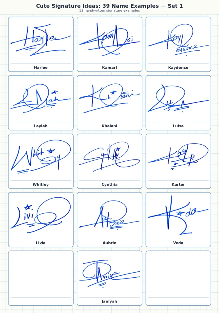
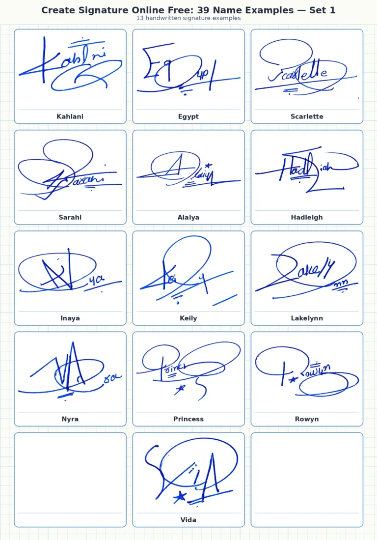
These individual handwritten signature images are included as supporting examples so visitors can compare one name at a time. Each caption preserves the name reference and makes it easier to study initials, loops, finishing strokes and overall signature flow.