Different Signature Styles: 10 Ways to Sign Your Name
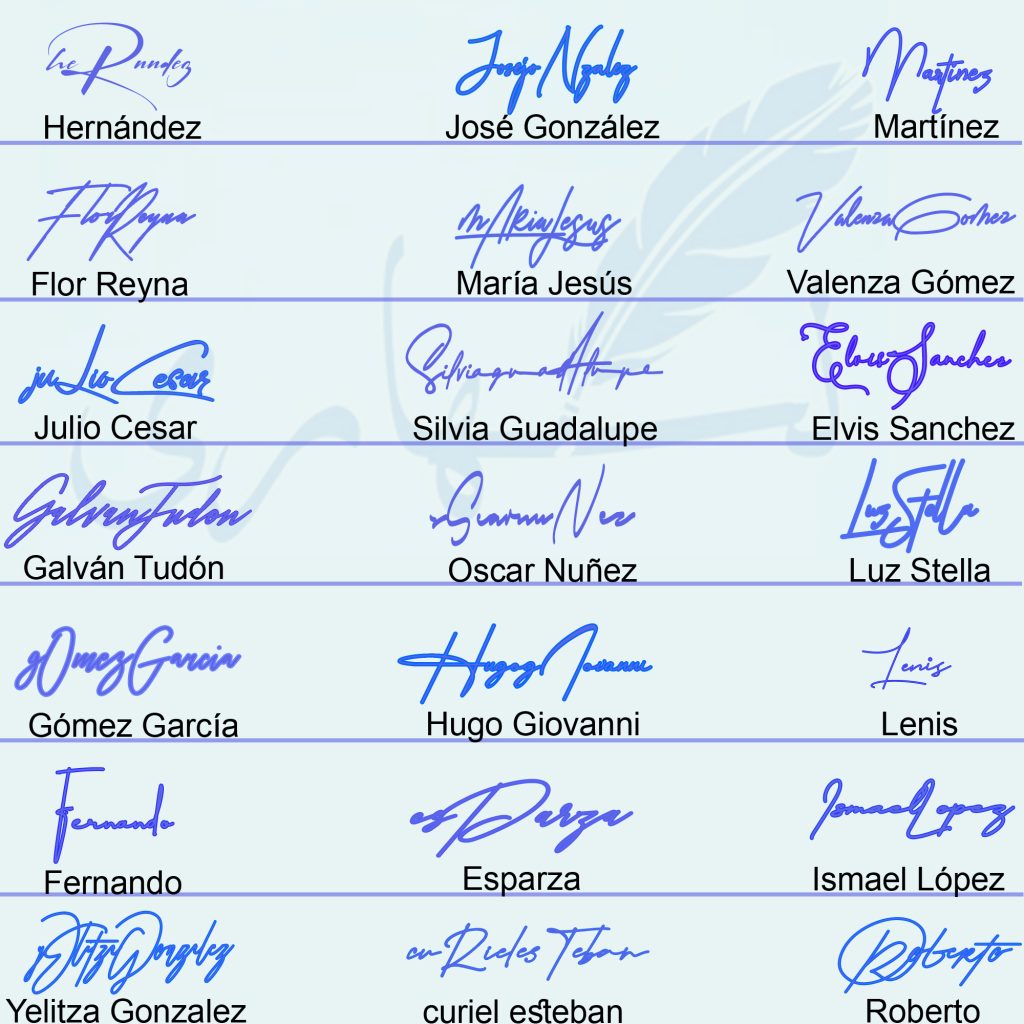
Different signature styles are created by changing the name format, letter connection, size of the initials, amount of readability and type of finishing stroke. The gallery below shows 21 handwritten examples, from compact surname marks and flowing full names to underlined, looped and initial-dominant designs.
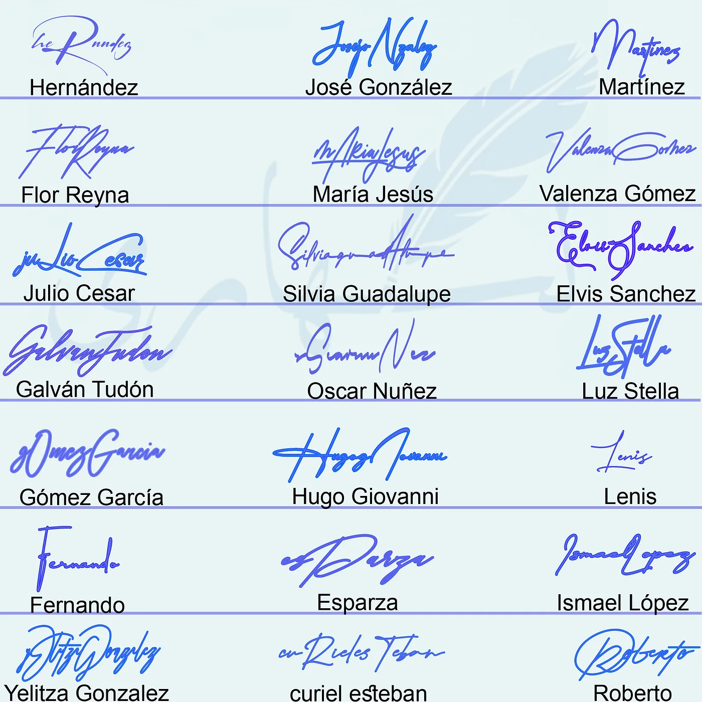
Rather than treating “stylish,” “professional” or “unique” as fixed categories, look at the construction of each signature. A useful style can be described in practical terms: full-name cursive, surname-only, large initial, two-capital, compact, underlined, angular, looped or minimalist.
In this guide
10 practical handwritten signature styles
| Style | Core construction | Works well when |
|---|---|---|
| Full-name cursive | First and last name written in one flowing movement | The name is not too long and natural connections are easy |
| First initial + surname | Large first initial followed by a compact surname | You want recognition without writing the full first name |
| Initials-only | Two or three initials combined or overlapped | You need a short, compact mark |
| Surname signature | Surname carries the whole design | The surname is distinctive or already used professionally |
| Minimalist | Few strokes, little decoration and controlled proportions | Speed and consistency matter |
| Looped cursive | Rounded capitals and connected lower-case loops | Your natural handwriting is fluid and rounded |
| Angular | Sharper turns, diagonals and compressed curves | You prefer a more structured visual rhythm |
| Underlined | Final stroke extends beneath the name | The underline can grow naturally from the ending |
| Two-capital | First and last initials both remain visible | A two-word name needs a clear transition |
| Abstract autograph | Letters are compressed into a recognizable movement | You can preserve the same core shape repeatedly |
How these styles appear in the gallery
Initial-dominant styles
Hernández begins with a large sweeping H-like movement while the rest becomes much smaller. Martínez also gives the opening capital most of the space. These designs demonstrate how one oversized initial can carry a surname without making every letter equally visible.
Connected full-name styles
José González, Valenza Gómez, Julio Cesar and Ismael López show different ways to keep two names in a continuous horizontal flow. The capitals create landmarks, while the internal letters are compressed. This approach is expressive but requires control over overall width.
Two-capital and mixed-scale styles
Flor Reyna, María Jesús, Silvia Guadalupe, Luz Stella and Yelitza Gonzalez use two visible capital movements. The better-balanced examples allow one capital to lead and the other to support it. When both are oversized, the middle of the signature can feel crowded.
Compact and minimalist directions
Lenis, Fernando, Esparza and Roberto use relatively concise structures. They show that minimalism does not mean plain block writing; a design can remain short while using a distinctive opening line, loop or final sweep.
Long underlines and finishing strokes
Several examples use the end of the name to create a horizontal base. An underline is most effective when it is the continuation of the signature rather than a separate decorative line. It should support the name without crossing so many letters that the design becomes difficult to reproduce.
How to choose a signature style
Start with name length
A short name can retain more readable letters and still remain compact. A long two-word name usually benefits from a strong initial, simplified middle strokes and a controlled surname. Compare these examples with the dedicated name signature gallery to see how different lengths affect composition.
Match the style to writing frequency
For frequent signing, prioritize a design with fewer pen lifts and a consistent baseline. For occasional creative or branding use, you may allow a larger flourish or more visible letters. The same person can keep the core signature structure while preparing a cleaner image version for design work.
Decide how readable it should be
Readability is not all-or-nothing. You can keep the first initial and surname recognizable while compressing the middle. A professional-looking signature does not require every letter to be perfectly legible, but the design should not depend on a random scribble that changes every time.
Choose one decorative feature
A loop, underline, long tail, crossing stroke or interlocking initial can make the design distinctive. Using all of them together usually reduces clarity and repeatability. One strong feature is easier to learn and easier to recognize.
Build a style you can repeat
- Write your name in ordinary handwriting. Mark the connections that already feel natural.
- Choose the name format. Full name, surname, first initial plus surname, or initials only.
- Select one focal capital. Increase its size or simplify its shape without turning it into a separate drawing.
- Compress the middle. Keep enough letter rhythm to connect the beginning and end.
- Test one ending. Compare a clean stop, short tail and underline made from the final stroke.
- Sign five times at normal speed. Check whether width, slant, crossings and ending remain reasonably consistent.
- Remove unstable details. The final version should be simpler than the first sketch, not more crowded.
For a letter-specific example, the letter E signature guide breaks one initial into looped, minimalist, monogram and surname-connected options.
Frequently asked questions
How many signature styles are there?
There is no fixed official number because styles overlap. A signature can be cursive, initial-based, short and underlined at the same time. It is more useful to classify the construction than to count labels.
What is the most professional signature style?
A professional style is usually controlled, repeatable and suitable for the way it will be used. Full-name, initial-plus-surname and minimalist signatures can all look professional when the proportions and movement are consistent.
Is cursive always better than print?
No. Cursive creates flow, while print or mixed print-cursive forms may improve readability. Choose the movement that feels natural and remains stable at normal writing speed.
What is the easiest style for a long name?
A large first initial followed by a shortened or compact surname is often easier than writing every letter with equal detail. Initials-only is another option when a very short mark is appropriate.
Can I combine two styles?
Yes. Common combinations include cursive plus underline, initials plus monogram, full name plus minimalist middle strokes, and large capital plus compact surname.
Single Signature Examples from This Collection
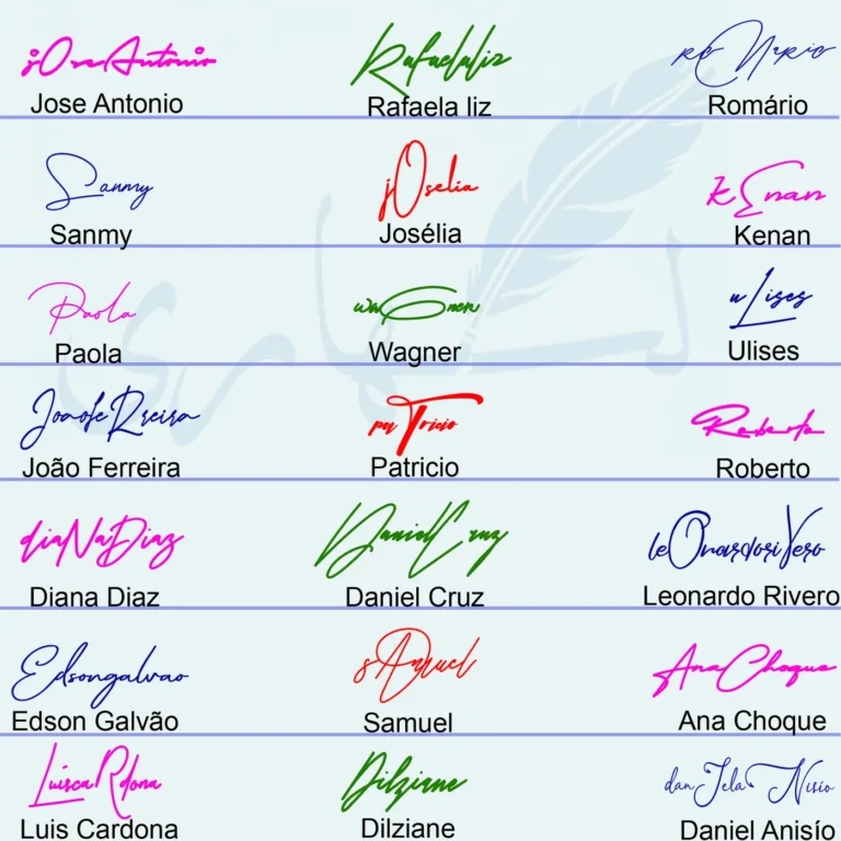
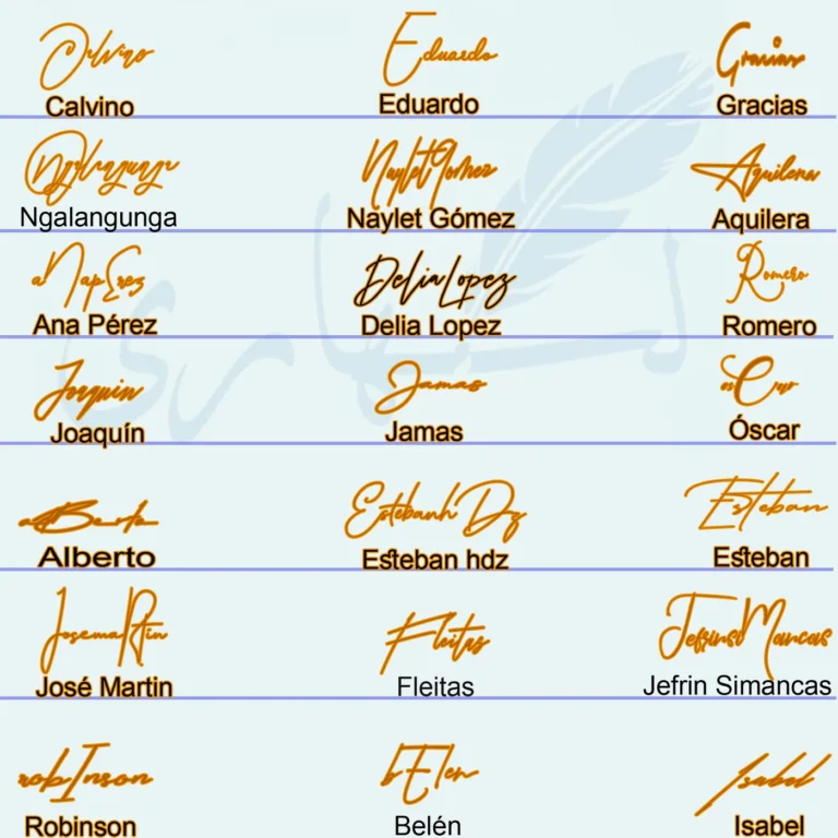
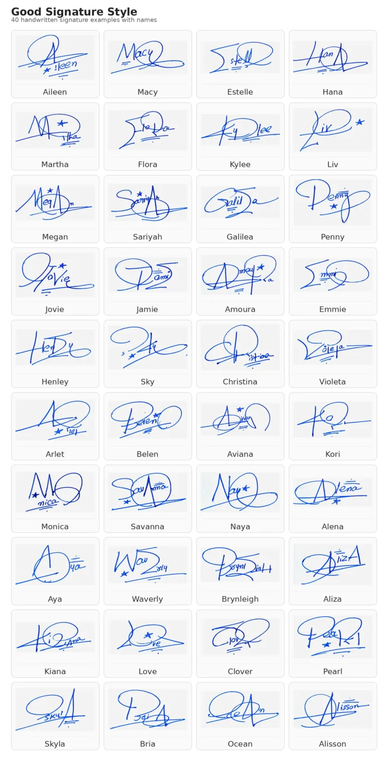
These individual handwritten signature images are included as supporting examples so visitors can compare one name at a time. Each caption preserves the name reference and makes it easier to study initials, loops, finishing strokes and overall signature flow.