Letter E Signature Ideas: 12 Handwritten Styles to Try
A letter E signature can be built around a looped capital, a compact initial, an E joined to the surname, or a more abstract monogram. The letter is flexible because its upper and lower curves can become entry strokes, connectors, underlines or long finishing movements.
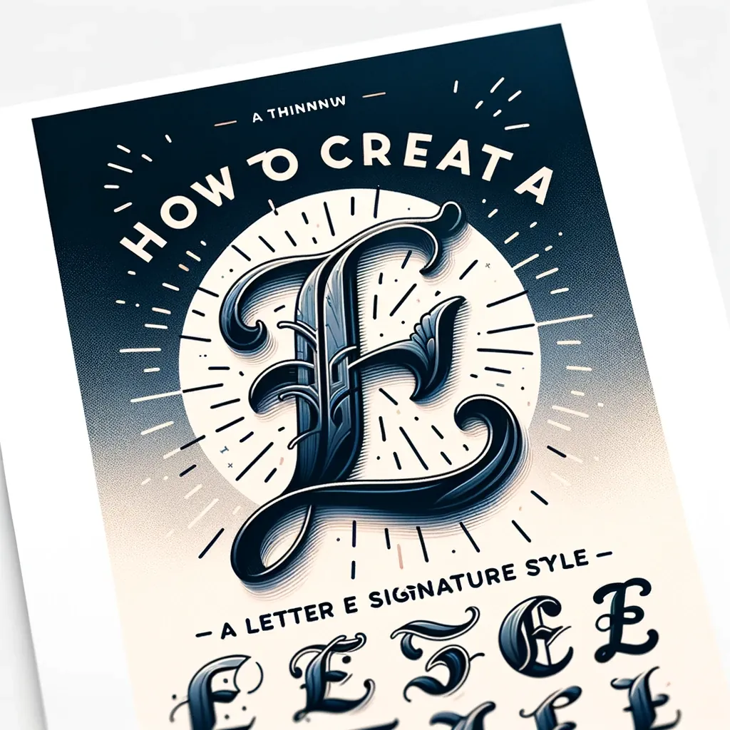
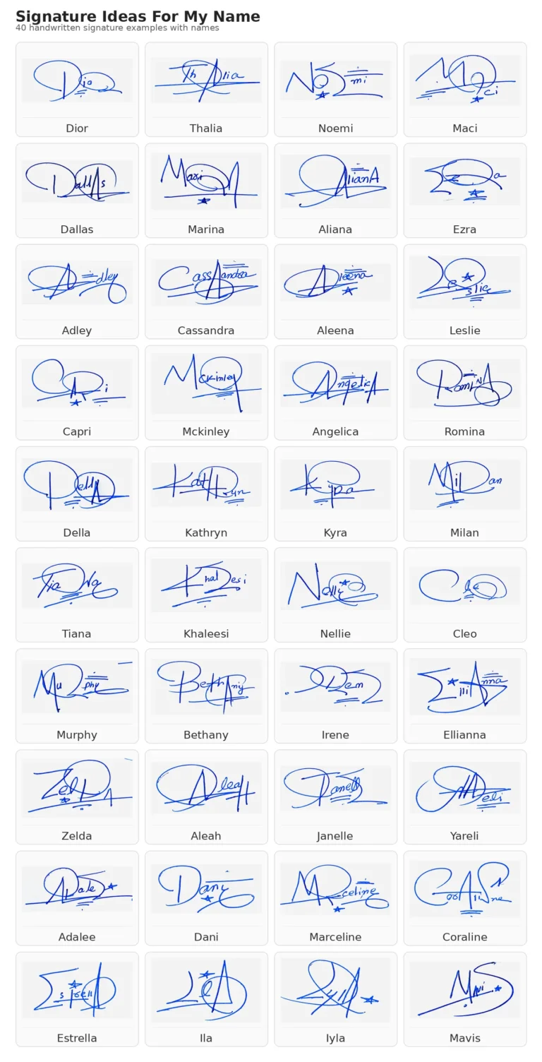
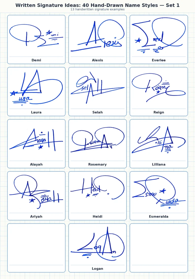
The image above is a decorative letter study rather than a tracing template. Use it to notice the large loop, central crossing and sweeping lower tail, then simplify those ideas into a movement you can write naturally. A strong signature should work at normal speed, not only when copied slowly.
In this guide
- Explore E signature structures
- Match the style to your name
- Build your own E signature
- Test readability and repeatability
12 letter E signature structures to try
1. Large looped E
Begin with a generous upper loop, pass through the center, and let the lower curve connect directly to the next letter. This works well for names such as Elena, Emma and Ethan because the E remains the visual anchor while the remaining letters stay compact.
2. Compact cursive E
Use a small open loop with a quick exit stroke. This is one of the easiest E styles to repeat and suits people who sign frequently or prefer a restrained appearance.
3. E initial only
Turn the E into a simple personal mark by emphasizing one distinctive feature: an extended middle bar, an open lower loop or a short underline. Avoid adding so many decorations that the letter becomes difficult to reproduce.
4. E plus surname
Write a prominent E, then connect it to the surname in smaller, faster strokes. This format balances recognition with speed and is useful when the first name begins with E but the surname carries more identifying information.
5. Interlocking two-initial monogram
Combine E with the first letter of the surname. Shared vertical strokes, overlapping loops or a common underline can make the initials feel like one design rather than two separate letters.
6. E with a tail underline
Extend the final stroke beneath the rest of the signature. Keep the underline related to the natural movement of the name; a separate line added afterward often feels less fluid.
7. Open modern E
Suggest the letter with one vertical movement and two curved arms instead of writing every printed bar. The result can look clean and contemporary while remaining recognizable as E.
8. Angular E
Replace rounded loops with sharper turns and a decisive diagonal exit. This approach is visually strong, but it should still move comfortably without repeated pen lifts.
9. Lowercase e lead-in
A lowercase e can become a subtle opening loop before the rest of the name. This is useful when an oversized capital looks too formal or consumes too much space.
10. E inside a partial circle
Use the opening or final stroke to create a partial enclosure around the initial. Stop before the shape becomes a complete decorative frame that slows the signature down.
11. Full-name cursive E signature
Keep the capital distinctive, connect the first name naturally, and reduce detail in the surname. The design should have one focal point rather than competing loops on every capital.
12. Short abstract E mark
Compress the signature into an E-like movement followed by one or two fast strokes. This can be practical for a long name, provided you can repeat the same structure consistently.
Choose an E signature by name length
| Name pattern | Useful E structure | Why it works |
|---|---|---|
| Short first name: Emma, Eric, Evan | Large E plus readable remaining letters | There is enough room to keep the whole name visible |
| Medium name: Elena, Ethan, Evelyn | Looped E with compact connected lowercase | The capital leads while the body stays controlled |
| Long first or last name | E initial plus shortened surname movement | Reduces writing time without losing the main initial |
| Two E initials | Interlocking or stacked EE monogram | Creates a clear repeatable relationship between the initials |
| E plus another strong capital | One large capital and one smaller secondary capital | Prevents both letters from competing for attention |
For more examples of how long and short names change a design, see the signature examples for different names.
How to build your own letter E signature
- Write your normal E ten times. Notice whether your hand naturally forms a loop, angle, open curve or printed structure.
- Choose one focal feature. Enlarge the upper loop, extend the middle crossing, or develop the lower tail—but not all three at maximum size.
- Connect the next letter. Test whether the exit stroke meets the next lowercase letter without a forced change of direction.
- Add the surname or second initial. Keep it slightly smaller so the E remains the anchor.
- Test an underline only if it grows from the final stroke. Compare the version with and without it.
- Write each option at normal speed. Discard any design that needs careful drawing every time.
- Select the simplest version that still feels distinctive. Practise it in short sets rather than filling a page with rushed repetitions.
Check readability, balance and repeatability
- Readability: the E or the main name structure should remain identifiable at normal document size.
- Balance: the capital should not be so large that the rest of the name looks detached.
- Connection: the lower exit from E should lead into the next letter without an awkward pause.
- Repeatability: the same core loops and crossing points should appear when you sign quickly.
- Economy: remove any line that does not improve recognition, rhythm or composition.
A letter-based signature can be cursive, minimalist, professional, fancy or abstract. Those labels describe different visual decisions, not different levels of quality. Compare the broader signature style guide before deciding which direction suits your writing.
Frequently asked questions
How do I make an E signature look unique?
Start with the E you already write, then change one structural feature such as the upper loop, central crossing, connection to the surname or final tail. A personal movement is more useful than adding random decoration.
Should the E be uppercase or lowercase?
Use uppercase when you want a clear focal initial. Use lowercase when you prefer a smaller, faster and more continuous signature.
Can I use only the letter E as my signature design?
You can design an E-based personal mark, but the acceptable form for a specific document or organization depends on its requirements. For everyday design practice, focus on a mark you can repeat consistently.
Which E style is easiest to write?
A compact open-loop E with a direct connection to the next letter is usually easier than a highly ornamental form with several crossings.
How can I practise the design?
Write slowly only long enough to learn the movement, then practise at normal speed. Compare sets of five and adjust the feature that changes most from one attempt to the next.